
I've always had a interest in all forms of physical print, and particularly in printmaking techniques such as screenprinting, risography and lino printing.
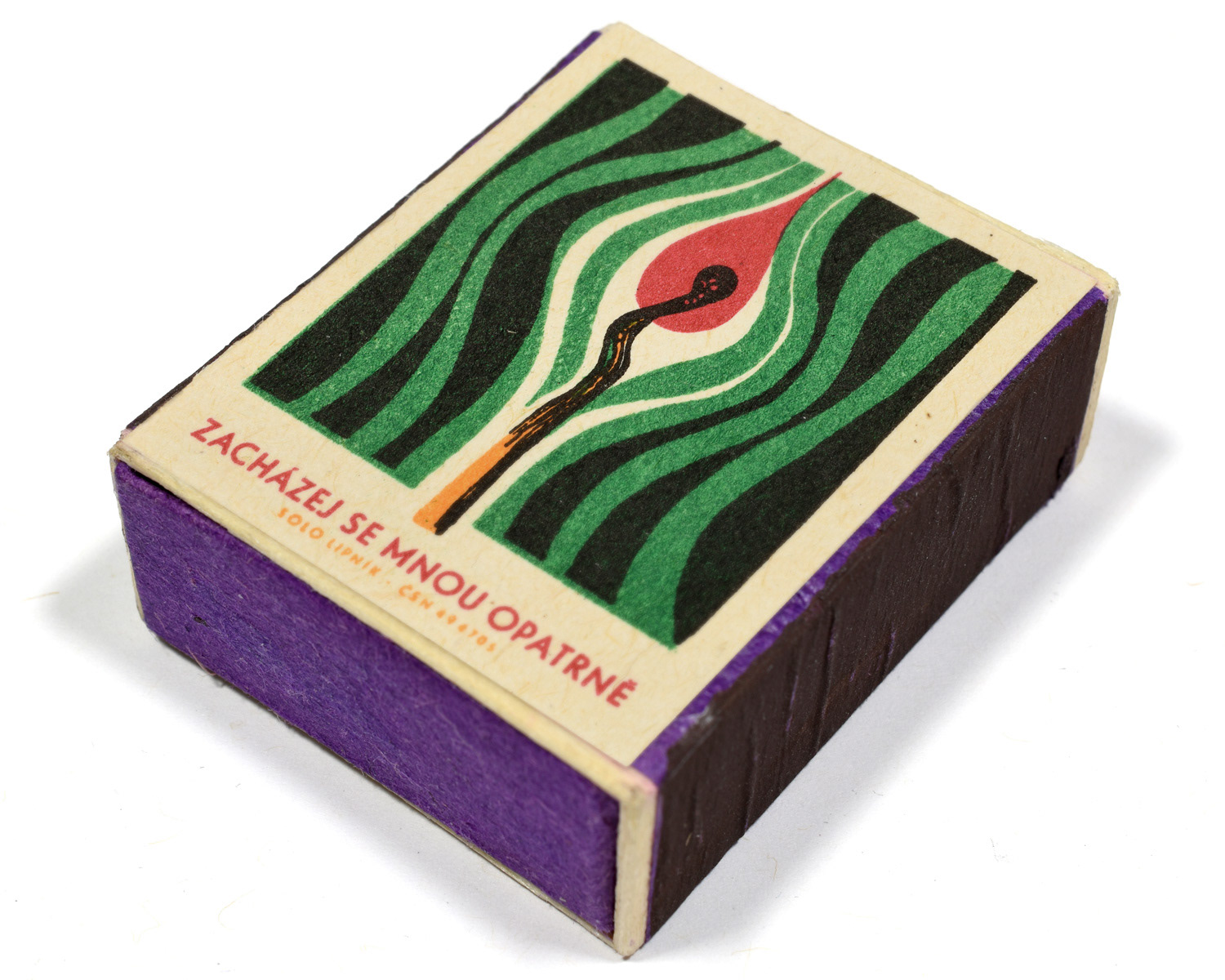
I discovered Czechoslovak matchbox labels years ago while researching a project and was immediately drawn to their striking artwork, and how they communicated so effectively on such a small canvas. At roughly 4 × 5 cm and constrained by letterpress and lithographic printing, artists relied on limited colour palettes and simplified shapes to illustrate these labels to great effect. These examples of mid-century graphic design demonstrate that visual communications can be simple, playful and absolutely charming.
That led me to start collecting and this site showcases a part of my growing collection, which I hope inspires the same appreciation that it has in me.
Matchbox labels had existed for decades, but their use expanded dramatically after WWII, particularly across socialist countries such as Czechoslovakia, Poland, the USSR and East Germany. Matches were a universal household necessity, so state-run factories produced millions of boxes annually, giving cheaply printed labels huge visibility and nationwide distribution for public messaging.
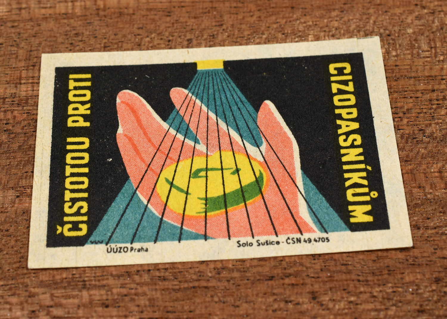
They weren’t only earnest public information announcements. Many series acted as little adverts for restaurants, bars, tourism, or major sporting and cultural events. Communist governments of the time also used these labels to influence the population and promote civic behaviour, workplace safety and health campaigns. The messages were mostly innocuous but some spread political propaganda.
By the 1990s, illustrated labels had largely disappeared. Cheap disposable lighters overtook matches, state industries collapsed or were privatised, and illustrated packaging no longer made economic sense. These matchbox labels now survive as miniature cultural time capsules, reflecting everyday life, design trends and public messaging from a very different time.
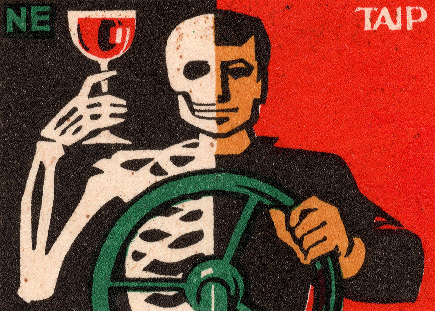
Across socialist countries, many matchbox labels carried stark public safety messages like this, using forceful imagery to shape behaviour and promote a safer, more orderly society.
The big three Czechoslovak match factories are Solo Lipník, Solo Sušice and Smrečina B. Bystrica. Only Solo Sušice is still open today, though it doesn't produce labels like this anymore.
A design by Czech artist Vilibald Weinzettl, who usually signed his work (zigzag symbol) when most artists went uncredited. His labels are some of my favourites from this period.